Improve Your Website Conversions and Grow Your Sales
Conversion rate optimization is probably the easiest way for an e-commerce brand to increase sales. It’s funny, I look at a lot of websites for clients and some days I cringe at what I see. I think companies feel like you can just put up a site, spend money on PPC (Pay Per Click Marketing) and the orders will start flowing in. Most don’t realize how important the website is to your overall digital marketing strategy. If you are going to spend money to get people to your site, then give your site the best chance to convert. That is the best spend you can make.
Last week the Hound Dog Digital team was meeting with a new eCommerce client who was frustrated with the returns they were getting on their digital marketing efforts.
We listened as they showed us all the marketing processes they were doing and had tried in the past. We looked at their Google Analytics and Adwords report and we definitely saw room for improvement. But the real improvement we saw was the site itself.
“What if we could increase your sales by 50% on your existing spend. Would you consider us to be geniuses?” Then I went into my conversion rate optimization fundamentals.
The homepage of a website focuses on exploration by the customer. Landing pages or product pages focus on conversion. So if you are using all of your ads and marketing to drive customers to your homepage, then you are not giving your site the best chance to convert them into buying customers.
Make Sure Your Homepage Is Doing Its Job
The key is to think about your homepage as a billboard for your brand. What is the single most important message about your brand that you want to get across as soon as a visitor hits your site? Make sure that value proposition is clear and the main focus. Then guide the visitor to where you want them to go. DO you want to take the visitor to a product trial page? Are you giving something away free? A subscription? Make sure that navigation is clean, clear and simple. Too many messages, too many focus point, too many directions make it difficult for the customer and lead to high bounce rates which reduces your chance for conversions.
Here is an example of a poorly designed homepage. I have no idea what to do or what I am looking at. I can’t even find the name of the site until I am halfway down the page.

Here is an example of a much cleaner site in the same channel.

Use Landing Pages For Your Ad Campaigns
Landing pages are for conversion. Build your ad campaigns around a specific landing page with a specific and simple offer and clear direction on what you want the visitor to do.
Here is an example of a great landing page for Lyft running an ad looking for drivers.

It doesn’t get much cleaner or clear. The visitor knows exactly what to do when they get to this page. Drive Your Car, Make Money. Fill Out This Form and Submit. My guess would be that this converted extremely high, probably double-digit conversions. Since this landing page in on the site, once the visitor does what you want, then have the ability to explore your entire site.
Remove the risk
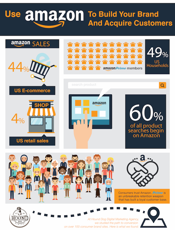
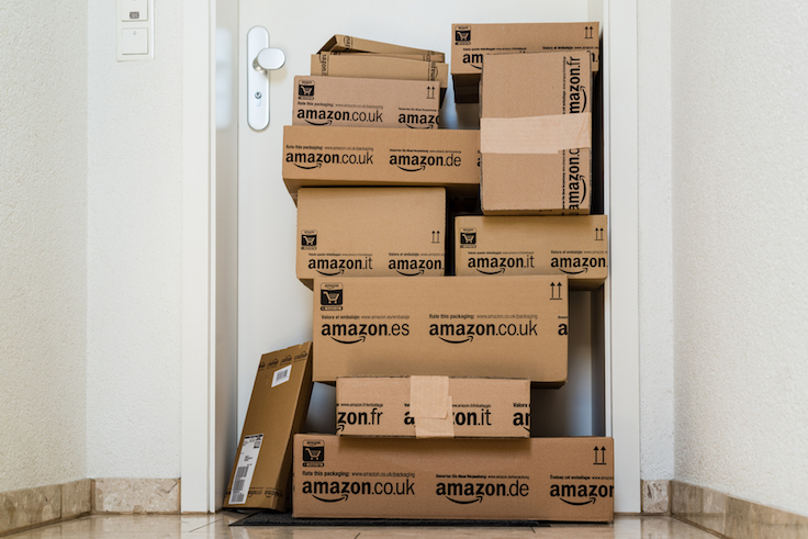
Customers are very concerned about identity theft risk. Reassure them on the footer of the main pages and especially on the checkout page. Make sure you tell them of your payment options, your secure status and anything else you can provide to reassure them. Unless you are Amazon, customers will still consider you suspect.
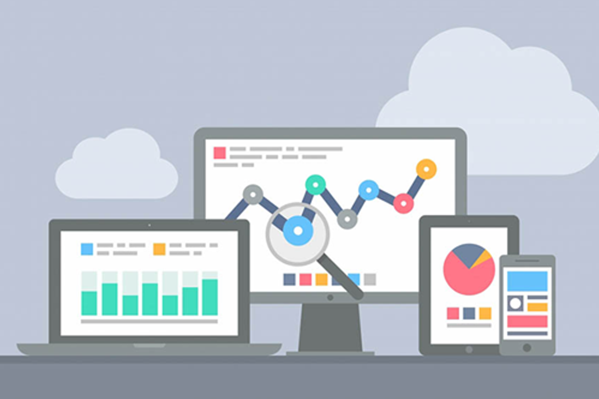
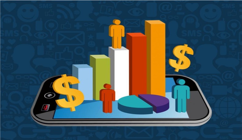
Conversion Rate Optimization Examples

![]()
Responsiveness
It is 2016, there is no excuse for not having a responsive site to respond to mobile and tablet screens. Although mobile still converts lower than desktop, it is important for customers to familiarize themselves with your site and bookmark it for later. The primary reason mobile still converts lower is because of the difficulty of putting in your payment info. That is why services like PayPal are important to an eCommerce site. It makes it easy and secure for customers to pay.
Make it Easy To Pay
Customers hate long, multi-page checkouts. Minimize the friction on this important step and create a simple and secure checkout for the customer. Don’t have them fill in information that isn’t necessary. If you take PayPal, then put it at the top before they fill in anything as it will auto-fill for the customers and if they are returning customers with an account, make sure they can log in on that page and not get redirected back to their shopping cart and checkout with one push of a button. Provide as many payment options as possible so the customer can decide what they want to use. I hear our own clients say “well, I don’t take that payment because the fees are too high.” How high was the cost to get that visitor to your page only to have them drop off because you want to save $1. Its not worth it so figure it out.
When I ran my own e-commerce companies, I always wanted to hear about problems with our site and our brand directly from the customer. So I always made it a point of reaching out to 5 customers each week and not our best customers. Usually, new customers because our best customers are going to love us while new customers have a different perspective.


[…] works best for your particular business and your conversion goals. Here are a few components of any conversion strategy that should help to quickly and effectively increase your conversion […]
[…] I create landing pages, I have several goals designed to ensure that consumers have a good experience and reach a desired […]
[…] Imagine walking into a restaurant with a line of people waiting to get in. You automatically assume it’s worth the wait, right? That’s social proof at work. People tend to follow the crowd, trust popular opinions, and seek validation before making decisions. In the digital age, social proof isn’t just a psychological phenomenon—it’s a game-changer for conversions and growth. […]